Creating modern, responsive, and visually appealing layouts is at the heart of web design. CSS offers two powerful layout techniques—Flexbox and Grid—that can make this task much more manageable. Rather than directly comparing them, let's explore one main practical tip for determining when to use Flexbox and Grid Layout in your web projects.
Who controls the size?
The most important question to ask is: Who should control the children's size? If the answer is the parent, then almost all the time grid will be the most suitable. On the other hand, if we want the children to control their own sizes, then probably it'll be flexbox to the go.
Let's see some examples!
E-commerce Products
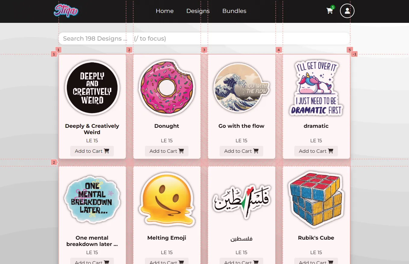
In this simple example, we don't really care about the content of the cards, just how we will display them next to each other.

So, here we have a list of cards, and we want to display those cards in the format shown above.
It's very easy, as we want the list (parent) to control how the cards are displayed, It's as if the list is saying "You go next to each other, and you all have to have the same size!".
So, we shall use a display: grid, and let the parent decide the size of the children.
Categories / Tags
Let's imagine we have a project, that has some categories or tags and we want to show them next to each other.

In this example, we don't want all the tags to have the same size, we want each tag to has its own width no matter how the siblings' widths were. It's as if the list is saying "Okay, you go next to each other. But figure out how to do it yourselves, I don't really care about each one's size". So, now we should use display: flex.
Features Section
Think of a landing page of a SaaS, and we want to implement this section where we list some features or selling points.

Tbh, months ago I would implement something like this with a flex box and it'll appear to work fine and achieve the same result. But let's dig deeper.
First, let's set a red border for the children to calculate their sizes. Now let's compare both implementations.
The flex method

Without the borders and the sizes showing, we would never notice something was off. But after measuring we can see that the last child has a slightly smaller width.
But why? As we said above when setting the parent as a flexbox, we tell the children "You figure out your own sizes, just make sure you are next to each other". And here, the last child has less content than its siblings, so they force it to shrink a little bit.
Imagine if the initial data had the same amount of content, and then later on you add a smaller/larger entry and keep debugging why this isn't working now while it was fine before.
The grid method

We can see here that indeed, this is the right way. Now the parent is more strict, and tells the children "Go next to each other, and make sure to all have the same width". So the parent draws 3 columns in one equal size and lets them fit right into it.
Conclusion
You may be asking yourself: "But I could do some of the examples you mentioned above using the opposite choice!", and you'd be 100% right. But you'll be adding too much unnecessary headache to yourself.
This is because once we set the parent to be a grid; we just specify the template-rows and/or template-columns, properties and automatically all the children will stick to the grid system we specified. But if we set the parent to flex, we will need to go to each child and set flex-basis to them and modify the flex-grow and flex-shrink properties to get them the exact size you want. Not to mention that flex-basis:33% for example won't give you a 3-column layout if you had some gap between the items. So it's just the easier implementation.
I hope this article was helpful, and if you have any questions or feedback, please feel free to reach out to me on Twitter or LinkedIn.